Tampilkan postingan dengan label fuchsia. Tampilkan semua postingan

Selasa, 19 April 2011

Color Club Alter Ego: Keep It Under Cover Collection Spring 2011 Swatches and Review

Aha... now here's the exciting part. Part two of Alter Ego (or really, probably part one, you can't really Keep It Under Cover after you've already revealed your mystery), Keep It Under Cover. This half is filled with glass fleck sparkle, duochrome shimmer and vibrant color.


Alias. This color has so many faces... It's purple, it's blue, it's glass fleck... It has yellow flash, green flash, red flash... Purple shimmer! Silver shimmer! Pink shimmer! It's freakin' awesome.


Alter Ego. This has a very greyed-out purple base with crazy gold and silver glass fleck shimmer. Very, very shiny... Very cool to look at.


Masquerading. This is an interesting color. You'll notice in the first picture that it dries matte. I'm not sure if it's intended to be a matte, it doesn't seem to have that typical matte formula and it doesn't chip as easily as mattes do... Just a bonus feature, I suppose! In the second picture I've added topcoat. It is a metallic grey-teal, a touch on the frosty side but not super streaky. Nice depth to it, though... Looks light in the middle and dark on the edges, I love that! Black highlights!


Secret Agent. Gorgeous silky vibrant purple. It's a frost. Like Masquerading, it's a silky frost, not a streaky frost. Just a very fine shimmer with a soft-feeling formula. Makes me think of Jessica Birds of Paradise or something.


Total Mystery. I have to apologize for these terrible pictures. Why does it always have to be that the best colors are the hardest to capture? This is the best color I've seen in a while. It's crazy. It's bright blue and purple. Blurple? It's duochrome and shimmery. It's like OPI Ink on steroids. Everyone who saw me wearing it commented on it. I just grabs your eye and won't let you look away. If you like blue or purple, you have to get this one. At least see it in person if you can.


Ulterior Motive. This is a fun one, too. It has a dark pink / dark fuchsia glass fleck base and lots of very visible blue and purple glass fleck pearls. Go ahead, enlarge the pictures, check out those sparkles! I love blue sparkles!

The formula on these was great as well. No application issues to be found. Great dry time and wear time. Opacity was good, but I did three coats on all just to see what it looks like. Also, since this set comes with the Vivid 10 Color Intensifying Topcoat, I put a coat of that on as well.

The Vivid topcoat is a lot like the Milky White basecoat; it has a slight blue-violet tint and it brightens colors. It's not really that noticable. It is a very nice topcoat, though. Very shiny, adds a little brightness. It makes a perfect refresher topcoat if your mani has lost its shine. Dries quickly.

Now, this collection has me excited. The excessive amount of purple and duochrome make my heart skip a beat. Every color is great and beautiful. Total Mystery is a definite must have for me, and I'm thinking about getting a few backups, I love it so much.

And hey... purple glass fleck duochromes for spring? I have to love them for that. Sure, they did pastels too, but they did this at the same time! They gave us holos and duochromes and glass flecks for spring a few years back... Now every year I can't wait to see what Color Club is going to do next. Always a surprise.

(These were sent to me for review.)

Selasa, 05 April 2011

Color Club Wicked Sweet Collection Summer 2011 Swatches and Review

I know... I haven't even posted the Alter Ego spring collection yet and I'm already onto the summer collection. But, since I'm so late in posting spring, I figured why not wait on it a little longer and post the summer sets while they're still relevant?

Color Club is doing two sets of neons this summer, and not just plain neons. This set, called Wicked Sweet, just so happens to to live up to that title. They're not just candy-colored, they're candy scented as well!


Get Your Lem-On. This is a pale, green-tinged neon yellow with a green duochrome shimmer. The sunlight picture shows the green shimmer best and the indoor picture shows the base color truest. It's scented in a sweet, light lemon scent. This has my favorite scent of the bunch. I'd wear it just to smell it! The color reminds me a bit of Color Club Volt of Light.


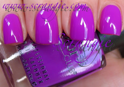
Gimme A Grape Big Kiss. This is the standard neon fuchsia-purple creme. It looks a bit washed out due to the brightness of the color, but it pretty much looks like most other neon purples. The color is great... but the scent isn't my favorite. It's a candy grape scent, and I've never liked candy "grape"... Somehow the candy interpretation of grape doesn't taste or smell anything at all remotely like a real grape. But, that's just my personal taste here, if you love that candy grape scent, you'll probably really enjoy the scent of this.


I Always Get My Man-darin. A light, desaturated neon orange with contrasting green shimmer. I tried to capture that green shimmer, I really did. It is sneaky, but it's there. Very pretty once you see it in its full glory. The base color reminds me of fake orange juice... Like... what's it called... Tang? Or Sunny Delight. *shudder* The scent is a sweet crisp orange. Very light, but pleasant.

Raspberry Rush. This one is fighting with Gimme A Grape Big Kiss for my favorite color in the collection. It's pink, yes, but it's an awesome obnoxious gorgeous bright pink! It's too washed out looking in this picture (these crazy neon colors freak out my camera!), but you can get an idea of how bright and pretty it is. It's a much deeper pink, more of a magenta. The scent is a sweet candy smell, like the rest, but I can't quite put my finger on what it smells like. It doesn't particularly smell like raspberries to me. It sorta smells like when you open a bag of gummy bears, all the smells mixed together. It's nice, and it reminds me of something from when I was a kid, but I just can't remember what!


The Lime Starts Here. Light neon green jelly-creme. This is close enough to jelly to call it a jelly, right? But it's still creamy looking. So... jelly-creme it is. Nice and bright. Yellow toned. Has a sour candy lime scent. I dig it.


Wicked Sweet. This one looks like Zoya Phoebe with topcoat, doesn't it? Bright near-neon blue with electric blue and gold shimmer. The greenish tint to the shimmer makes the whole polish look teal in some lights. Quite glowy and beautiful. The scent is... blueberry? Blue raspberry? It reminds me of Crater Lake Company's Lemon Blueberry Frosting scent. I'm gonna go with blueberry then. Love it.


Yum Gum. This is a light pink neon, similar to something like China Glaze Pink Voltage. It has a creamy white base to the pink color. I like the color, but that name... Yum Gum? Really? Anyway... the scent is... gum. Bubblegum. Not the overly sweet kind, but the sorta dry hard kind, like the one that comes in baseball cards. Do they still put bubblegum in packages of baseball cards?


The formula was perfect. I didn't really have any problems with application. The texture is on the thin side, but it's not runny. Some of the shades are on the sheer side, but all are good with three coats. I'm wearing three coats in these pictures. The lemon and lime shades would probably look even better with a fourth coat, but I haven't tried. The drying time on these is confusing. They set incredibly quickly, but I found that I was still denting them nearly 45 minutes after application.

One aspect of the formula is notably different than my usual polish reviews... There's a scent. The scent is strongest when first applied and slowly fades away the longer you wear it. When I wore these with a coat of Seche Vite, I could still smell the scent for three days. It was very weak on the last day, but still there. It's not so strong that it gives you a headache, but it's not so weak that you have to stick your fingers up your nose to smell it.

I love the scents in these. They're so much nicer than almost any scented polish I own. They're all soft and sweet, no sharp chemical fakeness. They really truly smell like candy. I remember some of the scented polishes I had in the 90s... I think the brand may have been Loud! Music, or something to that effect. I had a vanilla and an orange one. They have me the worst headache every time I wore them, they were so strong and invasive and sharply fake smelling. None of that here. It can be a little unsettling if you forgot you're wearing scented polish, though. The first time I tried them out, I kept thinking... What's that smell? Why do my hands smell like gummy worms?!

Overall, I'm a fan of this collection. Sure, the colors are fairly common neon colors. Heck, a lot of them even look like existing Color Club neons. The scents make them special. And you know me... I'm a sucker for anything scented. Vanilla scented garbage bags, remember? So yeah, I am definitely a fan!

(These were sent to me for review.)

Rabu, 16 Juni 2010

Illamasqua Spam


I feel like posting some massive Illamasqua spam. They stole my heart the minute I saw their products and have easily made my top five favorite brands.... Awesome colors... awesome name... formula like liquid glass... *dreamy sigh* I'm in an Illamasqua mood right now.

I might have posted some of these before, I can't remember.


Boo! Amazing purple, blue, pink and gold-ish multi glitter. Looks a bajillion times less blue in real life. More purple. Purple glitter. It's not a match to any of the recent purple-pink-blue glitter combination polishes as far as I can tell. This is unique- the glitter is teeny tiny and pretty sparse. Very sparkly, though. Possibly better for layering- this is four coats.


Boo over Sally Hansen Purple Heart. These Halloween ones (Boo and Hiss) were meant to be paired with Baptiste and Boosh for layering. I didn't have either at the time I took these pictures so I grabbed the nearest purple shimmer and tried layering. Looks awesome. Looks even better over black, I think. I don't have a picture of that, though.


Hiss! I don't have another glitter like this! It's gold based with really flashy pieces of hot pink and more subtle dark purple, blue and yellowy looking particles. The pink and gold seem dominant on me. Again, über sparkly, flashy, colorful but a bit sparse. Four coats pictured here.

Hiss over Wet n Wild Black. One coat over black looks pretty dense, doesn't it? But it doesn't seems as dense alone. Maybe I need to shake better next time. I love this even more over black. The glitter stays crisp and shiny looking.


Caress. Pastel baby blue creme. Love this. I had a polish like this in the 90s I use to love. Might have been a Hard Candy... Memory fails me. But yep, not too many other ways I can describe this other than stark creamy baby blue. Caress and Wink (below) were from the 2010 Spring collection.

Wink. This picture didn't come out so good. Hm. It's a pale lilac creme. Very white-based. Not as blue in real life. Pretty and delicate yet edgy because of the stark white crisp obviousness of it.


Force. AHHHH!!!! How hot is this?! It's super bold crayola blue. It's rich and pigmented and can change looks depending on the lighting. Here in the sunlight it looks almost neon bright, but indoors it tones down to a saturated and slightly darker looking blue. I layered Sally Hansen Hidden Treasure over this and it was one of the coolest flaky-layering combos I've ever done, couldn't stop looking at it. The girl at the museum with the chipped off gold glitter polish even raved over it when she was putting on my wristband! (Force, Jo'Mina and Prism are all from the current Summer 2010 collection- Body Electrics)

Jo'Mina (direct sunlight, outdoors)

Jo'Mina (ambient natural light, indoors). I am really upset about this one. Not about the polish, but about the pictures. I've been holding off on posting the Body Electrics collection because I couldn't get a good picture of this. It is extremely beautiful and it deserves an accurate representation. I'm failing to achieve that, so... Picture it less blue (getting tired of me saying that yet?), more red toned, more saturated and very IN YOUR FACE VIBRANT PURPLE!! It seems so much like a pastel here...it is light but I wouldn't call it a pastel... but in real life it's just so electric looking! I can't even describe it. Glowy light purple. I've never seen another polish like it.


Prism. Sheer white pearl with super strong blue iridescence/duochrome and subtle pink/green duochrome. Like mother of pearl. Also reminds me of a polish I had in the 90s. The 90s were a good time for polish. So much cool stuff back then. But... this is now and Prism is right here on the screen so I guess I should get back on topic... Prism seemed like it would be really sheer, but it's not really. First coat is very sheer but it builds nicely. I like the way it looks alone and I have worn it alone. This is three coats, you can see visible nail line but not too bad. I do four when I wear it.


Prism over Force. No words. Too pretty.


Prism over Jo'Mina. It accentuates the purple-ness of it and some of the duochrome shows green. Love.


Collide. Now this is what it's like when worlds collide.... Yes. When worlds collide, they become neon pink.


Grab. Interesting bright fuchsia-pink. Really rich looking. Purple toned. Creamy.


Hectic. Have I posted this one? I swear I've posted this one. It's amazing. Murky olive green. Right up my alley. Perfection.


DWS. This one was a surprise gift from a buddy and it quickly became my favorite light grey. It goes really well with my skintone. Applies like butter. Very glossy.


Whack. Really glowy bright jelly-ish almost neon orange. Very noticeable. Maybe a little bit of a red tomato or coral undertone to this. Mainly orange. Extremely loud orange.


Propaganda. Super dark blue jelly. A little bit like NARS Midnight Express. I made a huge mess when applying this one. It was comedic. I knocked over my bottle of remover and it covered my entire kitchen table. Went on the floor. Melted my pen. Only messed up the mani a little bit!


Smash. HULK SMASH!!!!!! I wanna say that when I wear this. Another kickass green from Illamasqua. There's nothing I don't like about this. I especially like the name... Head over heels I've fit in before... Now I don't want to do it no more... I just want to be who I want to be... Guess that's hard for others to see... (That was kinda the theme song of my life for a while!)


Strike. Metallic aqua blue. A little frosty, actually. Sparkly and frosty. And blue.


Baptiste. Last but not least... Baptiste. I made a rhyme! I can't think of anything to say about this polish. It leaves me speechless. It's so pretty. Almost too pretty. Iridescent shimmery vampy multidimensional purple. *drool*


Can't wait to see what colors Illamasqua will do next. Hopefully they'll do more of those incredible glitters for Halloween... Only four months away... I'm crossing my fingers!

(This post contains items that were sent to me for review.)

Pengikut